The Designers Talking series is part residency, part gallery and part conversation that seeks to connect thinkers, artists and problem-solvers through discussion about interesting ideas and solutions through the lens of graphic communication. Each of the twice-yearly seasons consists of three featured designers who are invited to do an eight-hour residency, followed by a gallery opening later that night. A discussion of the work follows the next afternoon.
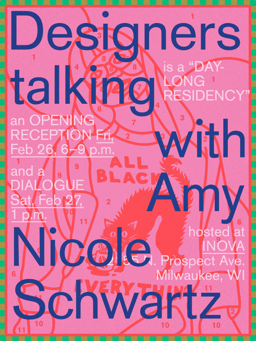
This week Amy Nicole Schwartz, lead designer for Cards Against Humanity, stops by INOVA in Milwaukee on Friday, Feb. 26 to help kick off the new season. The gallery will open to the public from 6 to 9 p.m. to show the results of the residency, and the ensuing conversation follows the next afternoon on Saturday, Feb. 27 at 1 p.m.
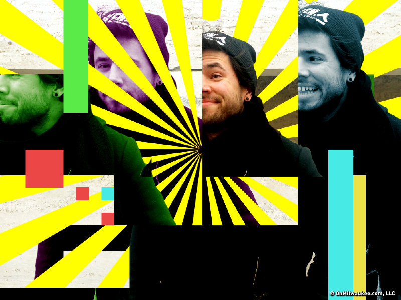
In advance of the residency, opening and talk, we met up with Nate Pyper, daylight graphic designer for the Milwaukee Art Museum and moonlight organizer for the series.
OnMilwaukee: First off and somewhat unrelated, you helped to design the new Milwaukee Art Museum logo, correct?
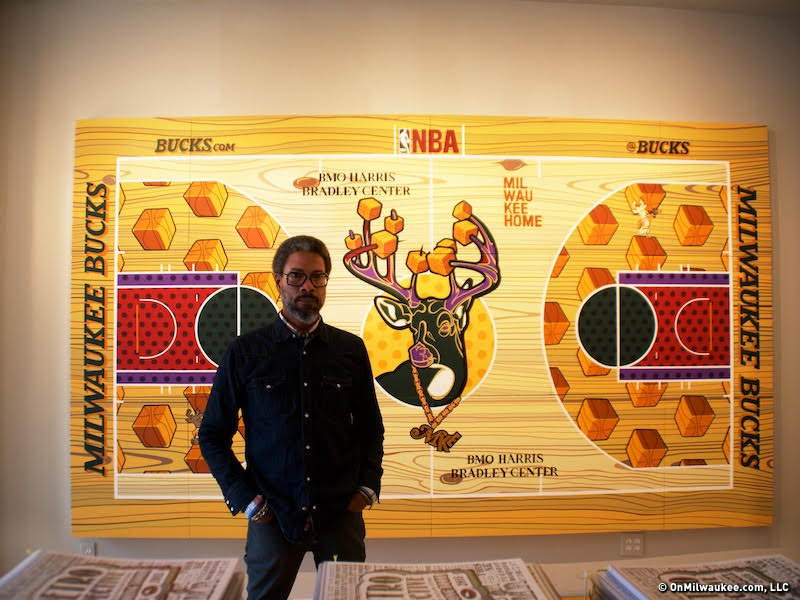
Nate Pyper: Yeah, me and my boss designed that. That was a lot of fun. We got to expand the look across the whole institution, which included way-finding, labels, gallery guides and new collateral. It was fun.
Cool. On to Designers Talking. What do you have planned for the new season?
The first designer is Amy Nicole Schwartz. She's the lead designer of Cards Against Humanity in Chicago. She went to Cranbrook [Academy of Art], and she also runs a space in Chicago called Liminal Space, which sounds like a design event space. She's super rad and funny. After that, there's a designer by the name of Silas Munro and a guy named Chris Burnett from Portland who works at Nike now, but he used to do all the clothing for Odd Future. Should be a fun season.

So how do these residencies work?
They get here on a Thursday night, and the residency usually runs from 9-5 the next day, so it mirrors a typical designer's work day. We come up with a prompt or a set of prompts that they respond to during the day. These prompts are formed around something that they're already passionate about, and the mediums they're excelling in or want to explore. They'll come up with ideas and execute them the day of. And that can take a lot of forms.
But the dialogue is really the center point of each visit. I'm interested in seeing what happens when you throw a graphic designer into the gallery space. So that's part of the point of the residency and producing new work. It becomes a reference point for the dialogue. Outside of that you can have conversations about design, but sometimes it gets a little too hypothetical or not based in any real world problems or issues or examples so it's not always productive. With this, we have a reference point. The dialogue sprouts out from that. It's very open, and it's like a round table discussion where the designer is there to host and facilitate the conversation but really it's a conversation with everyone. It's more like a punk show in a basement than a design lecture.
What do you look for in a designer for these residencies?
It's a mix of things. A lot of them are designers I've been a fan of for years. I know what they're doing, and I feel like I could trust them with a visit and a residency. I'm trying to get a diverse group from different backgrounds and different sub-fields: people who are doing web, print, and run the whole gamut. It's a mix of trying to find the perfect storm. Each season has three designers, so I try to imagine the perfect storm of designers that really compliment each other and understand how they would fit together in a season.
Do you have a plan for Amy Nicole?
A lot of her work is really digital and I guess clean. Vector-based. A lot of icons. She wants to do something different. Cards Against Humanity is a very clean, basic, Swiss-style. Helvetica. She's trying to do something out of the ordinary. The phrase she's been using to describe it has been "learning to use my hands again," so she's going to be working with a lot of traditional materials, like paint and sculpy.
What do you hope participants get out of this series?
I'm hoping to expand the conversation about design in Milwaukee and also the world. After these things happen, the work is documented, and the dialogues are recorded and they go online. People from all over see these things so the conversation really expands. You get a lot of different view points. Hopefully these conversations aren't just relevant to designers in Milwaukee, but also designers in the rest of the country that are thinking about these ideas – or want to, but don't have a space to do that. I think the hope is just to provide more access to different perspectives so that people are making more conscious decisions about what they're making.
Graphic design is a really good lens for thinking about "making" in general as well as the circulation of information. What's cool is that with a lot of the Saturday dialogues probably only half are designers; the other half are artists or writers or thinkers. People who are interested in the way information gets passed around. Graphic design just happens to be a good way to talk about that.
Is Milwaukee an ideal scene to talk about big ideas?
I think Milwaukee is a really exciting place for art and design to happen because there isn't a reliable market. Milwaukee's art scene is a post-market city so artists aren't creating work to sell in a gallery. It's not a viable option here so they are really pushing the limits of what art and design looks like because there's less at stake. They can experiment more. They can do crazier things because they're not relying on their work to also pay the bills. Which is a little cynical I guess, but it does create really awesome stuff happening in Milwaukee that can't happen in bigger cities because people are a little bit freer to do what they want. And it's cheaper to do those things here, too.
Do you have a particular style you keep an eye out for? How do you decide what looks good?
A lot of it is just gut. It's important to trust your gut. Usually the work I make ends up being cleaner and based on a grid system or whatever, but the stuff that always surprises me is stuff that is chaotic, or instinctual, or stuff that feels really honest but isn't necessarily following the rules.
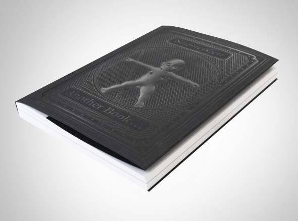
The design that ends up sticking with you is the stuff that makes you feel a certain way. Usually that means happy, or excited, but sometimes it f*cks you up. On the cover of a recent Stefan Sagmeister book, there's outline of a naked baby peeing, and I swear I'd thought I'd seen everything, but this gently embossed outline of a baby peeing stuck with me.
How is Designers Talking supported?
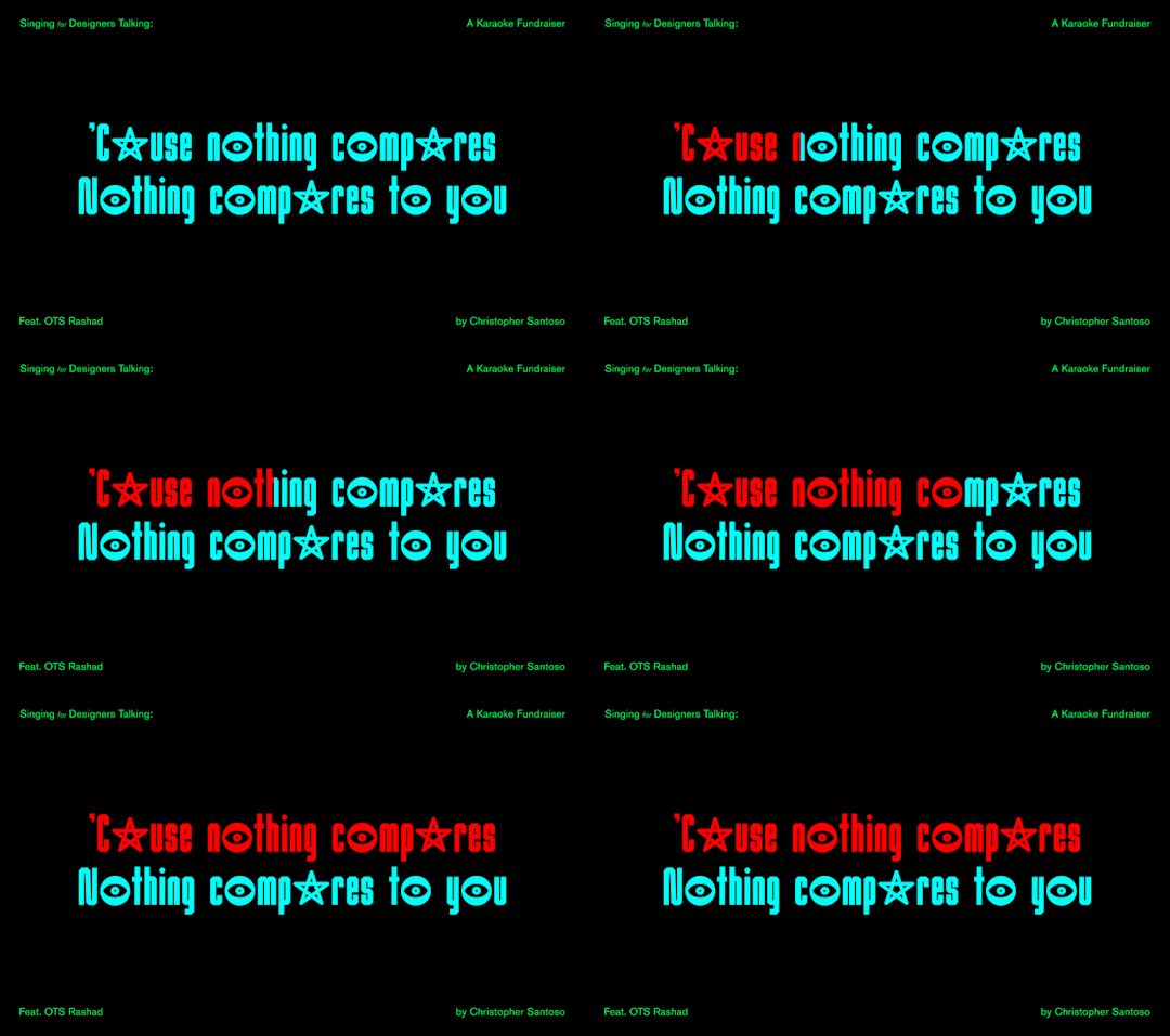
Mostly it's donation-based. But this is the second year I've hosted a karaoke fundraiser. I commissioned a typeface from a designer, and we used that font in the karaoke machine for the event. You got to see the font in action, and if you came out, you got a copy of the font. So that helped support the seasons. Mostly I rely on a lot of in-kind support.
It's also self-funded. A lot of it is just me spending money to make it happen.
You design the posters, too, right?
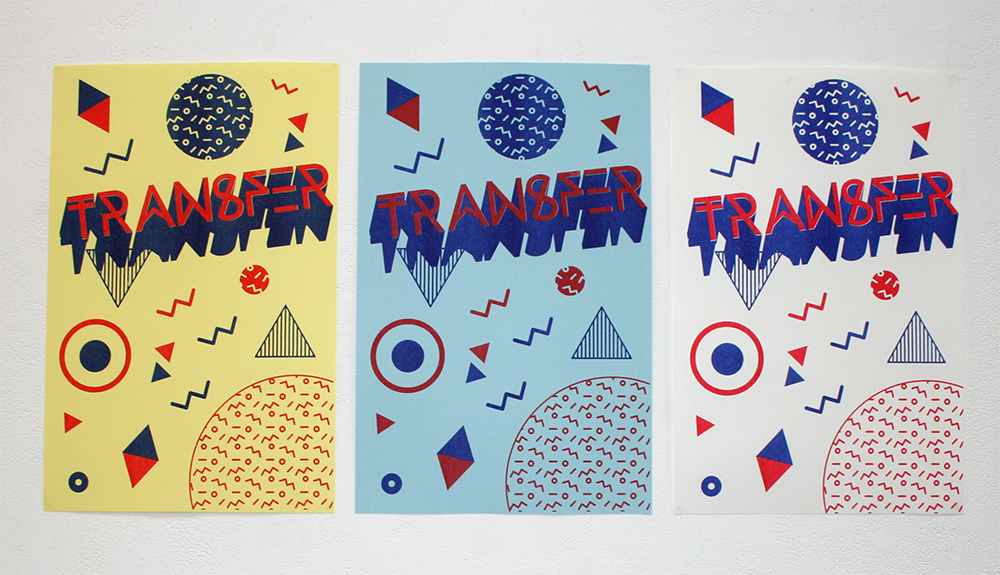
This is the one space where I can do whatever the hell I want. So it usually ends up being something really bonkers that I know I couldn't get away with at work or anywhere else. It's a balance. How do I make this silly and fun and cool, but also legible and actually tell people about the event. Each one is tailored to the designer based on either their aesthetic or the kind of work they make or what they're going to be making at the residency.
Any parting words?
Another thing I'm working on that I'm spending a lot of time on is this thing called Open View which is an abbreviated arts guide for Milwaukee, Wisconsin. I'm working on that with Paul Oemig and Ashley Janke. It's a monthly newsletter that provides people with a selection of events that are happening. It also include interviews with different people who are movers and shakers in the local creative community and will also occasionally include other stuff like reviews. It's a way to centralize information about the art scene in Milwaukee. We've been starting to get more traction with that and more support.
***
Designers Talking with Amy Nicole Schwartz opens on Friday, Feb. 26 from 6 to 9 p.m. at INOVA (Institute of Visual Arts) at 2155 N. Prospect Ave., and is followed by a discussion on Saturday, Feb. 27 at 1 p.m. You can RSVP to the event on Facebook.

More stories on:
nate pyper, milwaukee art museum, inova, designers talking, design, amy nicole schwartz, uwmShare with someone you care about:
Jason McDowell grew up in central Iowa and moved to Milwaukee in 2000 to attend the Milwaukee Institute of Art and Design.
In 2006 he began working with OnMilwaukee as an advertising designer, but has since taken on a variety of rolls as the Creative Director, tackling all kinds of design problems, from digital to print, advertising to branding, icons to programming.
In 2016 he picked up the 414 Digital Star of the Year award.
Most other times he can be found racing bicycles, playing board games, or petting dogs.

