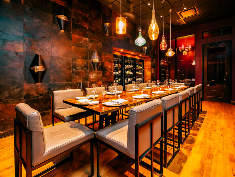
What makes a successful restaurant? It begins with the food. From there, success rides largely on the skills and savvy of the staff, both front and back of house. But another element is also key to the equation. There are few spots that make it without also providing a comfortable, functional environment for its guests.
Designing a restaurant interior that works on a variety of levels requires keen vision, skill and a great deal of hard work. It’s a magical formula with which the folks at Three Sixty (formerly 360 Degrees) – a design and build firm focusing on both commercial and residential interiors – have become increasingly familiar.
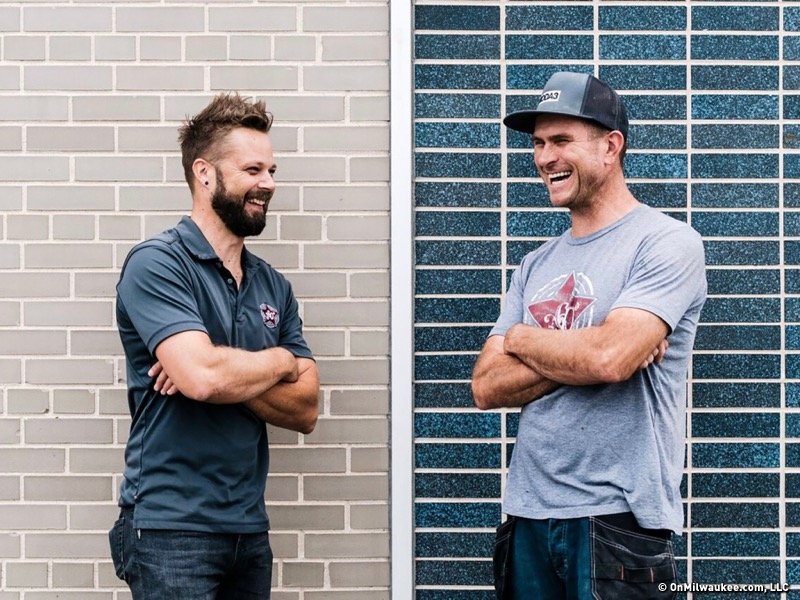
The company was founded in 2007 by Brian Polster and Rob Binter (pictured above), two design professionals who came to the business from opposite ends of the spectrum.
In that sense, the two colleagues are as different as they come. Polster, a graduate of MIAD, got his start working behind the scenes on a variety of projects and establishing his career as a design and build specialist. Meanwhile Binter, a graduate of the MATC landscape architecture program, worked for years getting his hands dirty for the sake of building amazing indoor and outdoor spaces. And it’s not just their backgrounds that set them apart; personality-wise, Polster is naturally extroverted and outgoing, while Binter is a bit more subdued and introspective.
But it’s these differences that offer strength to the Three Sixty brand. And it’s the yin and yang between Polster, who concentrates his energy on the concepting for each project, and Binter, who plans and coordinates the build out and the installation, along with the skills of Three Sixty’s 13 full-time employees, which makes the firm operate in an effective, efficient manner.
The company's new 20,000-square foot facility on Milwaukee’s North Side also helps. The space houses the spectrum of Three Sixty operations, including a full design studio, a resource library and a 17,000-square foot workshop where they accomplish a variety of aspects of steel fabrication and woodworking.
"One of the biggest components of our job is listening to the clients and really understanding what they’re trying to communicate with their brand," notes Polster. "Beyond that, our work is about telling their story through the environment we create."
Beautifully diverse Third Ward spaces
Over the past 10 years, Polster and Binter have worked on a wide variety of both residential and commercial projects. Among them are countless restaurants, retail and office spaces including spots like SportClub, Ugly’s Pub, Fixture Pizza Pub, Grassroots Salad Co., Moda 3 and Groom. However, it’s easy to illustrate the diversity of Three Sixty's work if you take a closer look at the five restaurant projects it has completed in the scant 44-acre expanse of Milwaukee’s Historic Third Ward.
"Each of the five spots we’ve built out in the Third Ward showcase a completely different style," says Polster. "And that is – in many ways – what we’re about. Our goal is to never do the same thing twice."
Cutting their teeth at Cafe Benelux
It’s been nearly a decade since the two owners took on their first big project finalizing interior details at Cafe Benelux, 346 N. Broadway.
In fact, he and Polster were brought into the project after the space was secured and leadership from Lowlands Group had already worked out the major details of the space with their architect.
"This project was a bit unusual," notes Polster, "The general construction was taken care of, and Mike Eitel brought us in to get creative insights on fixtures and finishes for the interior and by the time we were done we had nearly touched every square inch of the space."
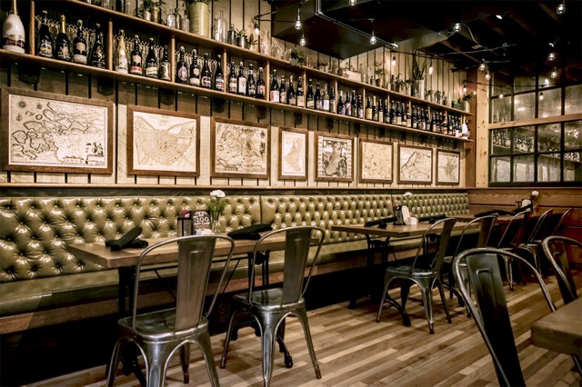
As is often the case with restaurants, the concept behind Benelux evolved in the years following its opening. Originally, Polster and Binter designed and built the grab-and-go cases in Benelux market; they later replaced them with additional booth seating. They also worked with Lowlands on the design for the addition of The Map Room and an expansion of their server station.
"At that point, we didn’t have the computer design we use now. We were working with pencil sketches," says Binter. "And while we do most of our building in the workshop now, a lot of the work we did there was on the fly and on site."
It wasn’t easy, he admits, noting that they worked 20 hour days for two to three months to complete the project.
"As difficult as it was, the process was rewarding and led to a lot of creativity on our part," notes Polster. "And that really was the start of the freeform art we’ve implemented in a variety of other projects."
From there, they were invited back to work on other Lowlands projects including Cafe Bavaria, the Cafe Hollander locations in Madison, Mequon and Brookfield, and upgrades to the Downer and Wauwatosa locations. It also led to an ongoing relationship with Eitel, who later hired them to design/build the space for SportClub, his newest venture at 750 N. Jefferson St.
Asian inspired design at Char’d
Designing the interior at Char'd, 222 E. Erie St., was a project that revolved heavily around budget, a situation that's exceedingly common in the world of low-margin restaurants. But the challenge was one that Three Sixty tackled with a deft hand.
"The main goal was to transform the space from its former identity as Hinterland," Polster notes. "But they also wanted to create a space that could transition from a more casual lunch atmosphere during the day to a more full-service restaurant at night."
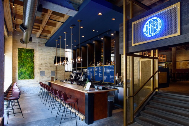
To begin, they worked with co-owner Lane Kim, who shared the Char’d logo, an element which established the restaurant’s navy and gold palette. She also told the team that she wanted to incorporate a significant amount of greenery into the design.
"She already had a pretty distinct vision for the space," notes Polster. "And ultimately our vision and hers became a good marriage."
In preparation for creating the design, the team researched the look and feel of a variety of Korean storefronts to glean inspiration for the restaurant’s bar with the goal of incorporating minimalist architectural lines innate to the design. This process led to ideas for the dining room entryway, which melds the traditional technique of shou sugi ban (charred wood) with more modern steel finishes.
Meanwhile, in the dining room, the goal was to really highlight the community table in the center of the room. And they did so with the help of uniquely designed lighting.
"We kept costs down by purchasing light fixtures – versus making custom fixtures – and then we fabricated the steel frame and panels between the fixtures," says Polster. "It’s meant to be simple, but also elegant. And as you move around it, the glass patterns catch the light in different ways."
Binter says it was a good example of an element that required quite a bit of engineering to execute.
"In the end, I think the structure surrounding the fixtures weighted at least 350 pounds," he says. "So hanging it was part of the challenge. I think we had six or seven people working on the install."
Edgy urban design at Dandan
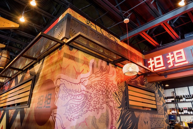
The two were also lucky enough to have been selected for the design and build-out of Dandan, 360 E. Erie St., one of the most anticipated restaurant openings of 2016. It was their first time working with Chefs Daniel Jacobs and Dan Van Rite, neither of whom had been involved in a ground-up restaurant design, so there was a learning curve on both sides of the equation.
"Our conversations started with planning for the Hinterland space," says Polster. "And then we switched gears when they secured the former Tulip space on Erie Street. From the beginning, they knew they were doing Chinese-American, and they knew they wanted something edgy. But they didn’t have the name or the brand completely fleshed out. So we brought RevPop Inc. on board, and I feel like we hit the nail on the head pretty quickly."
For this project, they looked to the graffiti work of Shepard Fairey for inspiration.
"His work offers the sort of repeating textures and lines and patterns that reference Asian design, but are also very urban," Polster says. "And that informed the way we began to see the space. The Tulip space really worked in our favor in a lot of ways. There were great swaths of exposed brick, and we used a lot of the existing structural elements to really complement our work. And … by the time we got to Dandan, we had probably doubled the size of our team, and we had a bigger shop to work with."
They were able to mimic the look of an urban alleyway in the hallway between the restaurant’s private dining room and EsterEv thanks to the installation of metal awnings. They made use of RevPop’s design skills to create the restaurant’s playful murals, and they used visual elements to create an open air look for the dining area itself.
Meanwhile, they used subtleties like the floral ceiling medallions mounted above the bar and the brass inlays in the tables to contribute to the series of repeating patterns evident throughout the restaurant.
Tiny challenges at Batches
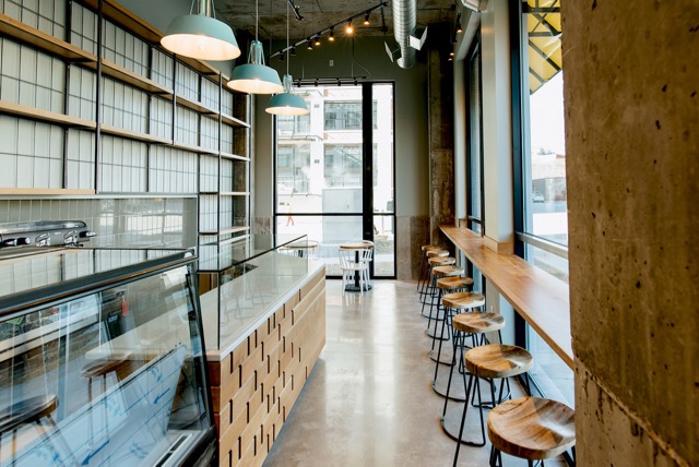
After working with Jacobs and Van Rite for Dandan, Three Sixty as brought back on board to design the space for Batches, a new bakery headed up by pastry chef Jaceleen Latin-Monagle.
"It was somewhat complicated in the sense that there wasn’t necessarily a clear brand concept when we started the project," says Polster. "But they had a pretty tight timeline. So we really focused on keeping the lines really basic and adding pops of color strategically. The materials are really raw and natural and the shelving on the back wall is really modeled after a modern baking rack."
Despite the challenges, he says the project was a gratifying one.
"At the end of the day, we loved the space," he says. "We kept things really clean and contemporary, and the linear details – including the white oak panels that run across the front of the counter – are really nice in the sense that it really allows the bakery itself to take center stage."
Rock n’ roll opulence at Fauntleroy
By the time they were asked to design the space for Fauntleroy, Jacobs and Van Rite’s new French spot at 316 N. Milwaukee St., Polster says, they’d developed a great working relationship with the chefs.
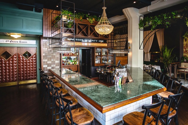
"They told us: ‘We want a rock 'n' roll inspired French restaurant ... Imagine if Mick Jagger in the early 70s was going to a French restaurant. We want that,’" he says. "And we ran with it."
Some of the design was inspired by a set of emerald green tiles with brass accents that the team came across early on in the process.
"Originally, they were going to be a part of the bathroom design." Polster says. "But they were pretty pricey. So, they didn’t make it into the final plans, but the emerald green began to carry over into other places. We worked it into the fabric in the dining room, the marble bar top and table tops and a number of painted millwork accents."
They were also able to create more freely, he says, because they’d built trust with their clients.
"You learn more and more about your clients, and you pick up on stories they tell," he says. "For this project, I knew we really wanted to have fun with fabrics, lighting and materials. And we wanted to go way outside of the box in a lot of ways. And they gave us the freedom to do that."
Despite that, the project wasn’t without its difficulties.
"The building itself posed a number of challenges," notes Binter. "The floors weren’t level AT ALL ... in fact, there are literally 600 pounds of floor leveler between the front of the lounge and the first booth in the dining room."
And sometimes, plans had to change as a result.
"We considered trying to restore the original terrazzo floors," says Polster. "But at the end of the day, it was literally more practical to go over everything with new hardwood. The nice thing about that was, even with the distinctions between the spaces, the hardwood was a unifying element we were able to carry through most of the space."
In the end, Polster says, their work is about not only making clients happy, but putting them in the best possible position to succeed.
"We’ve also worked on enough restaurant projects that we now know how to work with them to create spaces that are operationally functional," he says. "It’s not just about how things look; we’re creating interiors that can take the abuse of everyday wear and tear. And, in the end, we aren’t doing our job if your space doesn’t succeed and you’re not making the money that allows you to sustain your business. We want that initial investment to carry through and save you money in the long run."
For more information on 360 Degrees and its work, visit buildit360.com. You can also follow the firm on Facebook and Instagram.
As a passionate champion of the local dining scene, Lori has reimagined the restaurant critic's role into that of a trusted dining concierge, guiding food lovers to delightful culinary discoveries and memorable experiences.
Lori is an avid cook whose accrual of condiments and spices is rivaled only by her cookbook collection. Her passion for the culinary industry was birthed while balancing A&W root beer mugs as a teenage carhop, fed by insatiable curiosity and fueled by the people whose stories entwine with every dish. Lori is the author of two books: the "Wisconsin Field to Fork" cookbook and "Milwaukee Food". Her work has garnered journalism awards from entities including the Milwaukee Press Club. In 2024, Lori was honored with a "Top 20 Women in Hospitality to Watch" award by the Wisconsin Restaurant Association.
When she’s not eating, photographing food, writing or planning for TV and radio spots, you’ll find Lori seeking out adventures with her husband Paul, traveling, cooking, reading, learning, snuggling with her cats and looking for ways to make a difference.

